Ready Player Me
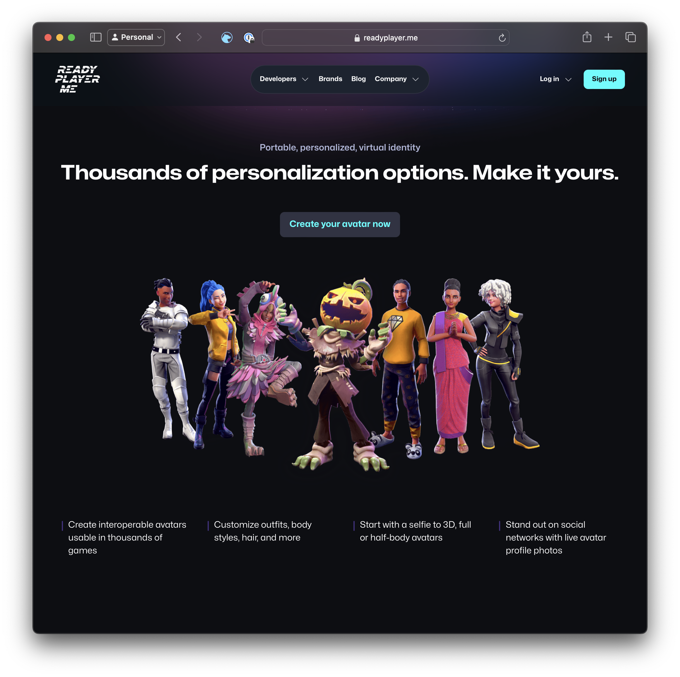
Ready Player Me provides a platform for developers to add personalizable avatars into games and digital experiences like VR. Their target audience is professional game developers at smaller independent studios who don’t have the time, experiences, or resources to build and maintain their own avatar creator. Ready Player Me gained significant traction with web 3 developers during the rush for organizations to align with metaverse trends.
Problem
There are many stakeholders in game development, from the studios, game developers, 3d artists, players, brands, and more. Ready Player Me had to appeal to each of these personas and plug into a game development lifecycle that could be upwards of two years for a major game title. My role was to better understand the developer lifecycle to see where the company could be most effective, and create a website experience that appealed to developers, players, and brands.
Solution
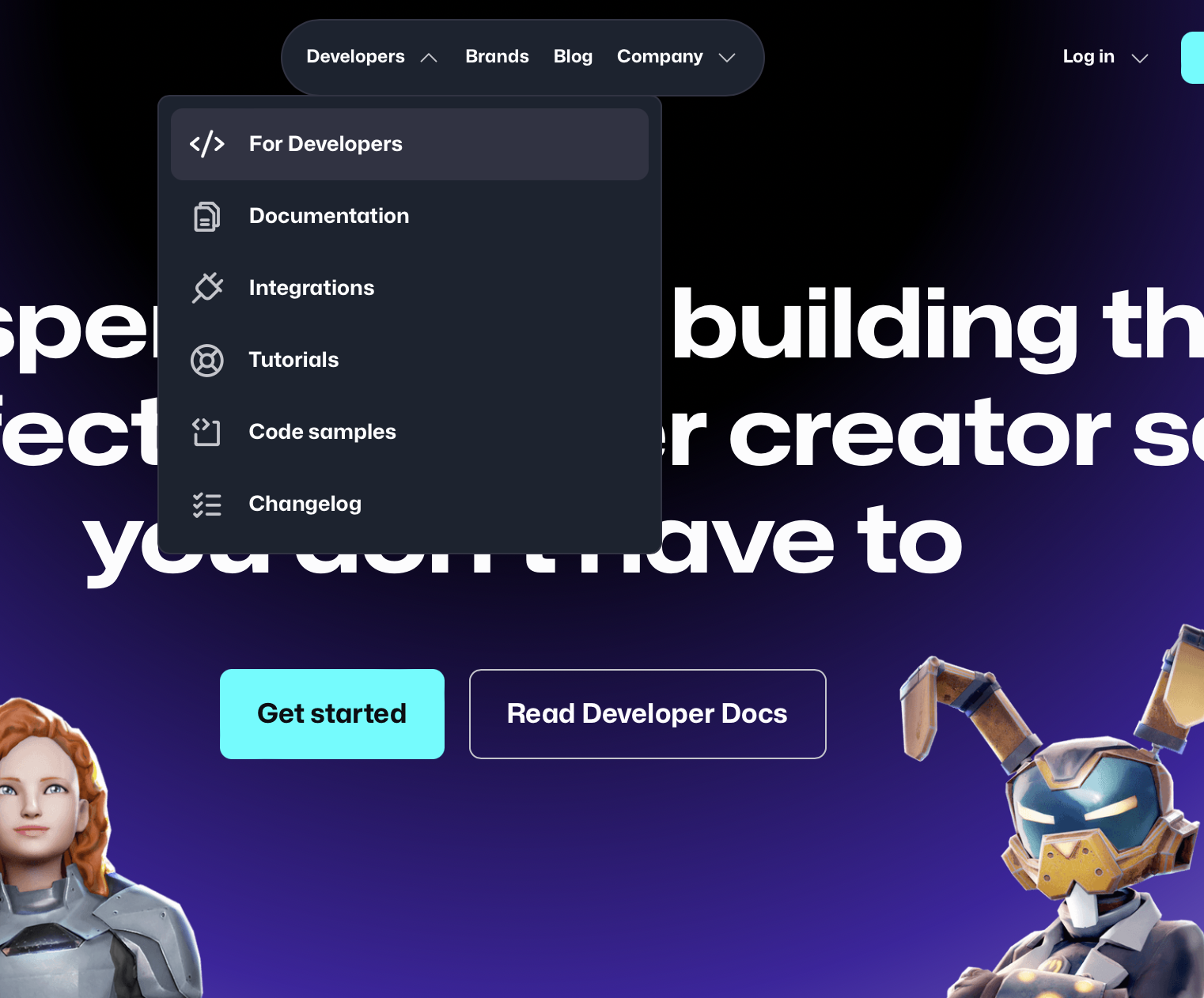
After creating a message house which defined key personas, pain points, benefits, and which features in the platform solved these pain points, we designed a global navigation system in Figma that would ensure that each persona was never more than two clicks away from the information they needed.
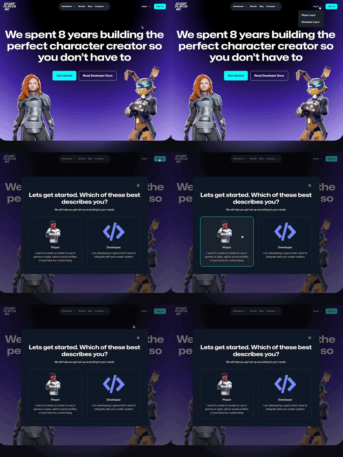
At the same time, we worked closely with executives to improve sign up conversion for both players and developers. After researching user flows via Google Analytics and HotJar screen recordings, we discovered significant drop off in developers when signing up. The problem was two-fold:
The majority of developers started by trying out the service via a free web-based Avatar Creator. This allows users to create an avatar from a selfie and customize hair, face, and clothing. The sign up flow from the avatar creator led users to sign up as a player rather than a developer.
The primary call to action on the website was not consistent or prominent on pages. Further, once you had signed up as either a player or developer, cookies prevented you from exploring any other route.
After designing the flow using Miro and mocking up in Figma, we implemented it in Webflow along with the rest of the website using shared components for a very modular and extensible solution.
Behind the scenes, we worked with the internal CRM and BI solutions to make developer lifecycle stages to nurture paths to ensure that developers remained engaged and active during the extended game development lifecycle. Nurture email campaigns were created which regular achieved greater than 40% engagement rate and helped grow signups MoM into the healthy double digits.
Final Thoughts
This was a very challenging project, working across multiple personas and a very extended developer lifecycle. By focusing on core messaging and intuitive navigation design enabled us to initially serve the right messaging for the audience, but also tie that into backend processes to ensure that new users remained engaged and aware of new features available to them.


